This level is for people who work alongside AI rather than build it. That might be a manager being asked to sign off an AI project, a product manager or marketer whose suppliers keep promising AI features, a lawyer, HR professional or civil servant working out what these tools mean for their area, or a teacher deciding how to respond to them in the classroom.
You do not need to write a line of code. We start with what these systems actually are: what a model is, what training does, what a large language model can and cannot do, and what "AI" means when a supplier says it. Then we look at the questions worth asking of any AI proposal. Where does the data come from? How would you know if it was working? What happens when it is wrong?
Sessions are one-to-one and built around your own industry, so we take apart the claims being made in your sector rather than generic ones. The field changes quickly, so part of the job is showing you how to keep up once we finish. By the end you can read a technical proposal without bluffing, ask the sharp question in a meeting, and tell a genuine use case from a sales pitch.
This level is for people who already work with data and want to do more with it. A data analyst who lives in Excel and SQL and wants to add Python, proper statistics and a working knowledge of machine learning. A business analyst or finance analyst who wants to automate the monthly report and build models rather than pivot tables. A researcher or scientist who wants to analyse their own data instead of waiting for someone else to. A software engineer who keeps being handed data problems and wants to understand what the data science team is actually doing.
We start from the data you handle in your job: the spreadsheet that eats a morning every week, or the report nobody quite trusts. We rebuild it properly in Python or SQL, then go further. Depending on where you start, that means statistics you can stand behind, clear data visualisation, building and evaluating a machine learning model, and using AI tools and large language models in your work in a way you can explain to colleagues.
Sessions are one-to-one and fit around a job: roughly an hour a week, with a small piece of practice in between that uses your own work rather than a textbook exercise. By the end you have a handful of tools you reach for without thinking, and something in your role visibly running better than it was.
This level is for people who want a job in AI or data science and are starting from somewhere else. The most common route is a data analyst moving into data science. I also work with software engineers moving towards machine learning engineering, PhD students and academics leaving research, economists, actuaries and statisticians retraining, and people from unrelated fields entirely. I changed field myself, from social science into data science, so I know what the route looks like.
Changing field takes months rather than weeks, and I will be straight with you about that in the first session. We map what you already have against what the roles you want actually ask for. Your existing domain knowledge is an advantage here, not a gap. Then we close the distance deliberately rather than hopefully.
The curriculum runs from Python fundamentals through data handling, statistics, machine learning and deep learning, and on to the tools employers now expect, such as working with large language models. A portfolio project on a subject you choose runs alongside it. Towards the end we turn to applications: your CV, the project write-up, and mock technical and case interviews of the kind I have sat on the other side of.
This level is for anyone curious about AI and data who wants to learn without the pressure of an exam. That includes school students who have not yet chosen their options, sixth formers and undergraduates who want to see what the subject is like before committing to it, and adults learning for their own interest. I accept students of any age and I am DBS certified.
There is no syllabus to keep up with and nothing to fail. We find a question you actually want the answer to, whether it is about a sport, a game, music or a dataset on something you care about, and pick up the Python, the data handling and the ideas needed to answer it. Along the way you meet the building blocks of statistics and machine learning, and get a clear picture of how the AI tools you already use actually work.
Sessions are one-to-one. I teach in small steps with plenty of practice, so progress feels steady rather than sudden. You build real things you can show people, and the habits you pick up make the formal courses much easier when you meet them later.
This level is for students on a course with data, statistics or computing in it who want to get more out of it. That might be GCSE or A-level Maths, Further Maths, Statistics or Computer Science, an undergraduate degree in data science, computer science, maths, economics, psychology or a natural science, or a master's such as an MSc in Data Science, AI or Machine Learning, including the conversion courses for people arriving from other subjects.
The sessions sit alongside your course rather than competing with it. You bring whatever is not landing, whether a problem sheet, a lab or the ten minutes of the lecture that went past too quickly, and we go back to the point where it stopped making sense instead of papering over it. Where there is room I take topics further than the course does, so the material becomes interesting rather than just assessable.
We can also build something that goes beyond the syllabus. A project of your own helps with coursework and dissertations, and gives you something to talk about in anything you apply for afterwards. Sessions are one-to-one, I accept students of any age, and I am DBS certified.
This level is targeted work against a named exam or application. For exams that means GCSE and A-level Maths, Further Maths, Statistics and Computer Science, and the statistics and programming modules of undergraduate and master's degrees. For applications it means university places in data science, computer science, maths and related subjects, admissions tests such as the MAT, TMUA and STEP, and degree apprenticeships in data science and software engineering, which are competitive and interview heavily.
For exams we work with the specification, the past papers and the mark scheme open in front of us. We find the topics quietly losing you marks, drill them, and practise under timed conditions until the paper holds no surprises. I spent four years at Cambridge Assessment, so I know how these papers are put together.
For applications we build something worth talking about: an independent project you understand all the way down. Then we prepare you to talk about it, alongside personal statements, admissions tests and mock interviews of the kind I have sat on the other side of. Sessions are one-to-one, I accept students of any age, and I am DBS certified.
Taught by a practitioner
I'm a data scientist and published AI researcher. I use these tools daily, so the examples are real and the material evolves with the field. That includes the tacit, on-the-job knowledge that bootcamps and AI assistants tend to miss.
Build your own portfolio
Every session builds towards an independent project on an AI or data science topic of your choosing. You leave with something concrete: work that stands out in a job or university application.
Designed with learning in mind
My method is grounded in established pedagogy, including Rosenshine's Principles of Instruction. Daily practice between sessions keeps you reviewing and consolidating the concepts that matter most.
A curriculum built around you
Built from my professional experience and four years at Cambridge Assessment, the curriculum is personalised and progresses from fundamentals to advanced concepts. It follows a spiral structure, revisiting earlier material at increasing depth.
Support for job and university applications
Support doesn't end with the last lesson. I help with job and university applications and run mock data science interviews, informed by having sat on the other side of the table myself.
FrankThanks for getting this far! I'm going to show you some examples of what we'll be covering in my sessions at Levels 2 and 3. The sessions rely on interactive visualisations as shown below, and on Jupyter notebooks to write and run the code. The following content covers some building blocks in statistics: the average, distributions, variance, standard devisions and correlations.
AThree kinds of average
Let’s start with a small example. A bakery sells ten loaves at different prices. The average price comes out at £2.47, but most people pay £1.20. So what is the average actually telling us?
Show the code
# Every loaf on the shelf, priced in pounds. Three everyday loaves# at £1.20, the rest creeping upwards, and one showpiece sourdough.prices = [1.20, 1.20, 1.20, 1.40, 1.60, 1.80, 2.00, 2.20, 2.60, 9.50]mean =sum(prices) /len(prices) # add them all up, share out equallyprint(f"The 'average' loaf: £{mean:.2f}")cheaper =sum(p < mean for p in prices)print(f"Loaves cheaper than the 'average': {cheaper} of {len(prices)}")
The 'average' loaf: £2.47
Loaves cheaper than the 'average': 8 of 10
One loaf costs £9.50 and that is enough to drag the average up. This kind of average is the mean: total price divided by the number of loaves. There are two other kinds of average, and they behave differently.
Show the code
# The MEDIAN: line the loaves up by price and take the middle one.# With ten loaves there are two middle prices, so average that pair.ordered =sorted(prices)median = (ordered[4] + ordered[5]) /2# The MODE: the price that appears on the most tags.from collections import Countermode, count = Counter(prices).most_common(1)[0]print(f"mean £{mean:.2f} <- the mean, total shared out equally")print(f"median £{median:.2f} <- the middle loaf")print(f"mode £{mode:.2f} <- the most common price ({count} loaves)")
mean   £2.47  <- the mean, total shared out equally
median £1.70  <- the middle loaf
mode   £1.20  <- the most common price (3 loaves)
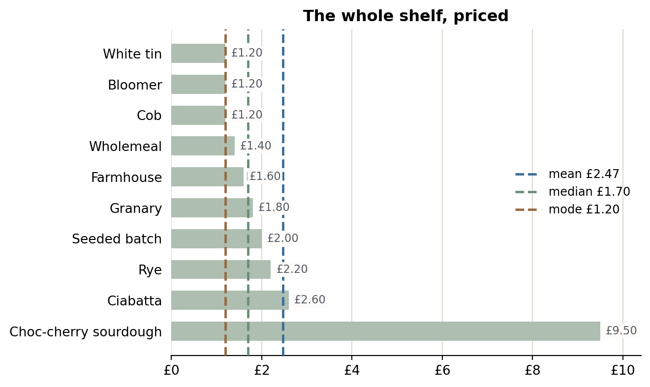
The three averages are more than a pound apart. Always visualise your data, as this unlocks more understanding. That is a habit I will keep coming back to.
Show the code
import matplotlib.pyplot as plt# The same prices, with their names back, cheapest firstloaves = ['White tin', 'Bloomer', 'Cob', 'Wholemeal', 'Farmhouse','Granary', 'Seeded batch', 'Rye', 'Ciabatta','Choc-cherry sourdough']fig, ax = plt.subplots(figsize=(7, 4.2))ax.barh(loaves, prices, height=0.62, color='#AEBEB0', zorder=2)ax.invert_yaxis() # cheapest at the top, showpiece at the bottom# Price on the end of each bar (pale backing so the lines can't strike it through)for i, p inenumerate(prices): ax.text(p +0.12, i, f'£{p:.2f}', va='center', fontsize=8.5, color='#545A63', bbox=dict(facecolor='#FDFCFA', edgecolor='none', pad=1.2), zorder=4)# The three "averages" as vertical lines through the shelffor value, label, colour in [(mean, f'mean £{mean:.2f}', '#3C6E97'), (median, f'median £{median:.2f}', '#688E76'), (mode, f'mode £{mode:.2f}', '#976840')]: ax.axvline(value, color=colour, linewidth=1.8, linestyle='--', label=label, zorder=3)ax.set_xlim(0, 10.4)ax.set_xticks(range(0, 11, 2), [f'£{v}'for v inrange(0, 11, 2)])ax.set_title('The whole shelf, priced', fontsize=12, fontweight='bold')ax.legend(loc='center right', frameon=False, fontsize=9)ax.xaxis.grid(True, color='#DDD8CE', linewidth=0.8)ax.set_axisbelow(True)ax.spines[['top', 'right', 'left']].set_visible(False)ax.tick_params(left=False)plt.tight_layout()plt.show()
Nine bars sit under £3 and one reaches £9.50. The mean lands where there is no loaf at all. The median and mode stay with the loaves people actually buy. Each average answers a different question. The mean tells you about total takings. The median tells you what a typical loaf costs. The mode tells you the price you are most likely to pay. None of them is wrong. You just need to know which question you are asking.
Try it below. Move any price and see which averages move with it. You can add loaves by clicking on the axis.
Try itDrag a price. Click empty space to add a loaf.
-
BThe shape behind the numbers
A list of numbers is hard to read. A picture of how they are spread out, called a distribution, is much easier. Below is a full day of the bakery’s sales on the same price axis. Most loaves are cheap and a few expensive ones trail off to the right. Drag the curve into a new shape, or pick one of the presets, and watch the three averages move apart.
Try itDraw on the curve or pick a shape. The slider controls how smooth your strokes are.
With a symmetrical shape, the three averages sit on top of each other. With a skewed shape, they separate in a fixed order. The mode stays at the peak, the mean gets pulled towards the tail, and the median sits between them. The gap between mean and mode is a quick measure of skew.
CThe normal distribution
The normal distribution is the most important shape in statistics. Heights, exam marks and measurement errors all roughly follow it. You only need two numbers to draw one: the centre, and the average distance from the centre. Try changing both.
Try itOne slider moves the bell, the other widens it. Each dot is one person.
The dashed line is the centre and the arrow is the average distance from it. Move the centre and the bell slides. Increase the distance and it gets wider and flatter. Notice that each new sample has its own centre and spread, close to what you set but never exactly. Real data is always a sample, so what you measure is an estimate.
DSpread, written down exactly
The average distance from the mean has a proper name and a formula. It only takes a few steps to get there. Step through them below.
The mathematics, step by stepclick to fold away
The same steps in Python. Two football teams, same mean height, different spread.
Show the code
import numpy as np# Two teams, identical mean height (175 cm), very different spreadsteam_a = np.array([173, 174, 175, 176, 177]) # tightly groupedteam_b = np.array([160, 168, 175, 182, 190]) # all over the placeprint(f"means: {team_a.mean():.0f} cm and {team_b.mean():.0f} cm")
means: 175 cm and 175 cm
Show the code
# The chain from the equations above, for team Bmean = team_b.mean()deviations = team_b - mean # x_i - x-barsquared = deviations **2# (x_i - x-bar)^2, minus signs gonevariance = squared.mean() # s^2, the average squared deviationsd = np.sqrt(variance) # s, back in centimetresprint(f"deviations: {deviations}")print(f"variance s^2 = {variance:.1f} cm^2")print(f"std dev s = {sd:.1f} cm (NumPy: {team_b.std():.1f} cm)")print(f"team A, for comparison: s = {team_a.std():.1f} cm")
deviations:  [-15.  -7.   0.   7.  15.]
variance s^2 = 109.6 cm^2
std dev  s   = 10.5 cm   (NumPy: 10.5 cm)
team A, for comparison: s = 1.4 cm
The mean is the same for both teams. The standard deviation is not: 1.4 cm for Team A and 10.5 cm for Team B. It tells you something the mean cannot.
Here they all are on one bell curve. Drag the spread, then switch each one on or off to see where it sits.
Try itDrag the spread and toggle each quantity. Notice the variance grows much faster than the standard deviation.
ETwo variables at once: covariance and correlation
Everything so far has been about one variable. Most real questions involve two. Does revision time change with exam marks? Height with weight? The measure for this is the covariance, and it is a small change to the variance formula. One more step turns it into the correlation.
From variance to correlation, step by stepclick to fold away
Here it is on a scatter plot. The dashed lines are the two means. Every point’s contribution to the covariance is measured from those lines.
Try itDrag the correlation and watch the points. Or press Guess it and try to estimate the correlation of a random cloud.
A positive correlation slopes upwards. A negative one slopes downwards. Near zero it is a shapeless cloud. The chips underneath show the covariance moving with the slope, and r staying between −1 and +1.
Show the code
import numpy as np# Revision hours vs exam mark for eight studentshours = np.array([1, 2, 2, 3, 4, 4, 5, 6])marks = np.array([45, 52, 49, 60, 66, 70, 74, 80])cov = np.cov(hours, marks, ddof=0)[0, 1] # covariance between the twocorr = np.corrcoef(hours, marks)[0, 1] # covariance / (sd_hours * sd_marks)print(f"covariance {cov:.1f} correlation {corr:+.2f}")
covariance 18.4 correlation +0.99
FSame statistics, different pictures
One last thing. Summary statistics can hide a lot. Here are thirteen datasets with almost identical means, standard deviations and correlation.
Show the code
import pandas as pd# Thirteen small datasets, each just an x and a y columndf = pd.read_csv("data/datasaurus.csv")stats = df.groupby("dataset").agg( x_mean=("x", "mean"), y_mean=("y", "mean"), x_sd=("x", "std"), y_sd=("y", "std"),)for name, g in df.groupby("dataset"): stats.loc[name, "corr"] = g["x"].corr(g["y"])print(stats.round(2))
Thirteen datasets, and to two decimal places the numbers are identical.
Now look at the visualisations. Choose a dataset and watch the points move while the statistics stay put.
Try itPick a dataset. Watch the points move and the statistics stay the same.
One of them is a dinosaur. The summary statistics had no idea. This is why I always plot the data, and I will ask you to do the same.
FrankI hope that gives you a feel for how the sessions work. We also cover examples which go into other foundational topics such as probability and combinatorics, and/or more cutting edge topics such as machine learning, deep learning, and AI.
Like what you see?
Get in touch and I can tell you more about how the sessions would work for you.